Colour can make or break your car, minibus or van wrap design
A good design used well can boost brand awareness. Here’s how to use colour for high impact. Contact Vehicle Sign Writing today
Designing a successful car wrap is about more than words and images. One of the most important ingredients is the colour palette you choose, and it’s worth knowing a little about colour psychology to influence your choice. In this article, we’ll take a look at how to use colour for the best effect.
The psychology of colour
Before you start choosing colours for your van wrap, it’s important to remember that not everyone will react the same way to the colours you choose. For example, in some cultures, white is the designated colour of mourning and red is an auspicious colour for weddings.
The colours we love or hate are also influenced by our environment and upbringing. And when it comes to designing for your business, you’ll need to incorporate your brand colours into your design for consistency across your visual assets. Colour can evoke an emotional response in your audience. It’s worth knowing the broad meanings of colour so you can use them in clever and evocative ways.
Black is associated with power and elegance and is popular with luxury brands such as Chanel and Gucci.
Red is youthful and buzzy and increases an appetite which is why it’s used by fast food restaurants.
Yellow is cheerful and optimistic. It’s also a high-contrast colour that’s often used with black fonts for attention-grabbing logos.
Orange is a combination of red and yellow and is commonly used by food and toy retailers.
Green is associated with nature and prosperity. Hence it’s used by businesses from Whole Foods and Starbucks to John Deere and Nerdwallet.
Blue is the right choice if you want to project an image of stability, strength and trustworthiness. Brands as diverse as Samsung, Nivea and Oral-B have blue logos.
Purple exudes wealth and luxury. Cadbury’s, Urban Decay and FedEx are some companies that tap into the associations of this regal colour.
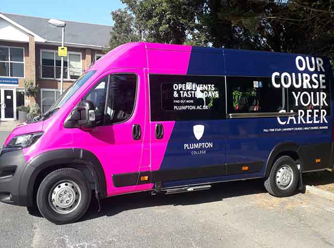
Van wrap colour decisions
Your vehicle graphics are likely to be a combination of colours. However, there are a few other factors that contribute to a successful and eye-catching design.
Contrast
The key to design success is to use font colours that provide high contrast to your background colour. We’ve already mentioned the use of black fonts against yellow, but you could also experiment with white lettering against a rich and saturated blue or orange background. Remember, contrast is the key to making your call to action really pop.
Brand
If you have distinct brand colours, it’s important to keep your overall colour palette aligned. Experiment with different tones and hues to achieve a balanced and harmonious design that foregrounds your critical messaging.
Industry appropriate
There’s a reason why fast food outlets use red and yellow, and banks tend to use blue and green logos. Using a colour palette appropriate for your industry is an intelligent way to tap into your customers’ expectations.
Van wraps from Vehicle Sign Writing
Need a hand choosing vehicle wrap colours or looking for some inspiration? Please contact Vehicle Sign Writing today and we’ll be happy to help!